Showing posts with label interior design. Show all posts

Friday, May 30, 2025

From Lone Star Drab to Love Island Fab: Another Dream Come True


As a sort of follow up to my recent post, "Follow My Florida Dreamin'," I want to also share another way I followed a little dream to a happy trigger that keeps on giving. Specifically, my primary bathroom and bedroom. When I looked at houses in Texas for my relocation last year, I gave each house a nickname, many of which were hilarious to my realtor (and I happen to agree). There was "My Castle" which was the giant house with a turret, but when I saw it, the houses across the street put its turrets to shame and I ended up renaming it to "My Doll House" because it looked like a life size doll house. The house I really wanted was a very modern, Asian-esque model-perfect house with a pool, hot tub and backyard about which I still dream - with its pool ledge and modern appeal. But, they didn't accept my offer and it may be for the best for two reasons: the commute would have been significantly longer and more annoying (nearly impossible to avoid multiple school zones), and, I would have been incredibly reluctant to customize it and make it my own, because it was so stylish the way it was, just not exactly the styling I was considering. The house I ended up buying, I had nicknamed, "Just Ugly Enough," because it had good bones and was in a lovely neighborhood, but I absolutely hated the colors of the interior. That is actually a benefit, to me, because if I hate it, then I have no qualms about painting over it, and it was only cosmetic work that needed to be done to make my own, nothing structural or otherwise significant.

So "Just Ugly Enough" became my new home a year ago, and between work travel, personal travel, and just not wanting to unpack boxes and whatnot, it took me a little while to finally start getting my home into the style and color schemes I wanted. To be fair, there was another, more direct reason for my delay - I had mocked up several variations on my laptop, but I was nervous about the bold colors and concerned they'd be too much. Finally, I decided I just had to push forward. I was happy enough with the latest mockups, and it was just paint, right? If I absolutely hated it in a few months, I could always redo it. It would be a pain, to be sure, but, as a recent meme said, "Everything is figureoutable."

I started slowly but with commitment - attacking first my huge, imposing fireplace with bright pink paint. I worked on it steadily but only as I had time. Even before the painting was complete, I could tell I loved it! The part of the fireplace that had been painted looked so good. I kept going. I painted the mantel and hearth a light gray to tone down the pink. When it came to the cabinets, I was thinking blue, but hadn't quite settled on the specific shade, so I taped the paint swatches of the leading contenders up to the cabinets so that I could see them in the exact light throughout the day that the actual paint would be in. I finally determined which one I liked the most and got that painting done.

Moving onto the primary bedroom and bathroom, I pretty much was set in stone on what colors I wanted in the bathroom, but again was nervous because it was, well, a lot. I struggled with what I wanted to do with my room, though, because I wanted it to match, but I also didn't want it to be too much. Weirdly, for me, I settled on painting over the ugly greyish blue with a plain white in the bedroom, and then using accents to bring the color forward - pillows and bedding, and, neon lights!! At night, which is the best time to be in a bedroom, with the neon on and the regular lights off, it has exactly the look I wanted without
being crazy. The other thing I really liked in my room was that I ended up repurposing a tall glass cabinet that had previously been used to display movies, and I made it a display case for my various feminine accessories - necklaces and rings, my various Coach purses, and a few tokens and nicknacks. It became a functional storage in the disguise of a fashionable display case - maybe borrowing a little inspiration from the Barbie movie or the Barbie Dream House design challenge on HGTV.

The bathroom, though, is my prized room now. It is exactly right in so many ways. Prior to painting and adding wall décor, I had been collecting various accessories to match the theme I was aiming for. A fancy pink and gold picture frame that has a call bell and the caption, "Ring for Champagne" sits on the window sill next to a little bubble bath container in the shape of a bottle of champagne and a hot pink rubber duckie with the face of a flamingo, because, obviously. A silly pink hand statue, originally on top of my medicine cabinet, was
relocated to the window sill. The corner shelving has my bath supplies - bath bombs, epson salts, shaving crème and razor, and a hot pink loofah to tie it together. On the medicine cabinet, I had these cute little pink containers for Qtips, hair ties, hair clips, swabs, etc. I found an adorable pink digital clock that I had originally placed on top of the medicine cabinets, but post-painting, it found its way to a white wall to create that contrast in color.

The problem was, all these cute hot pink accessories clashed with the baby blue wall color and the hideodeous hand stamping and those dated mirrors. It was time to paint! But that's a lot of work, so I hired someone. I put up post it notes on each wall to make it very clear which color would go where, and showed him. And thankfully, he didn't try to talk me out of the wild color design. He worked all day, but got both rooms done - so much faster than I would have!

The wall around the bathtub is a bright turquoise, and I changed out the white sheer curtains that were there for hot pink sheer curtains (which I had bought months in advance). I had changed the color of the chandelier in my mockups, but I ended up leaving it as the white chandelier that was there because it was a good contrast to all the color. On one wall, I created an artificial "living wall" with fake plants from Hobby Lobby. On the other wall, I have a neon sign that says, "Hello Gorgeous" which is a straight shot of visibility from the toilet, a great message to see as I start my mornings. The little toilet room, although without a door to actually separate the space, just a door frame, has the same bright turquoise color. 

The wall with the vanities is bright pink. Other than that, the other walls are white. The hand towels are turquoise, pulling in that color towards the pink vanity area, while the curtains pull the pink into the turquoise bath area. On the floor, bright yellow rugs of various sizes are arranged and often re-arranged by my cleaners, and honestly, the variety is kind of fun. Sometimes the long one is in front of the vanity to accommodate both sinks, other times it's by the bath tub and the wider rug is in front of my primary vanity.

The VOCs seemed to linger much longer than I anticipated, even with open windows and fans for several days. So I googled what plants were the best at absorbing CO2 and VOCs and invested in a few real living plants to help with the issue functionally, and bring some more organic décor into the space. Of course, I hate making new habits and I knew watering would be a pain for me, so I bought a few of those glass watering globes, but not just any, I bought hot pink flamingo shaped ones. I found another fun pink accessory - what looks like a little balloon
dog, but made of hot pink transparent plastic or something similar. And now, all the hot pink décor I had bought before finally makes sense.

I toiled over what mirrors to put over the vanities - I could put the old ones back up, but I just hated how they look, even though they do sort of match the cabinets. I thought about getting really fancy ones with LED lights. But in the end, I went with a very simple, modern look of rectangular mirrors with rounded corners. I hate to drill new holes for them and install dry wall anchors - previously my nemesis for some reason, but I have no idea why, these were actually really easy to install - and once they were up, I was instantly pleased with my selection.

Not everyone likes the room - my sister especially despised it. But luckily, she doesn't have to live here. And I absolutely adore it. The motif and colors were largely inspired by my favorite trash TV show - Love Island, and honestly, after picturing it and mocking it up over and over again, I don't think it could have turned out any better. I absolutely love it. And what's more, every time I walk in there now, I get a little tingle of excitement and giddiness and joy. Whereas I would almost feel depressed walking into that blah blue bathroom before, now the colors delight me and the wall décor feels like it was always there. It's literally like seeing a dream come true, albeit another smallish dream, but a dream nonetheless. 

It occurred to me that there was a book called, "Dunk Tank Pink" that had a multitude of anecdotes, including the one referenced in the title about how painting a jail cell a very specific color pink was statistically shown to calm drunk people down and reduce alcohol-fueled violence and incidents. While pink is not usually the color most people reach for to paint their bathrooms with, I wonder if part of my enjoyment is somehow related. Or, maybe I'm just embracing the feminine aesthetic being a strong, single woman. And it's not just pink. It's the whole Love Island vibe. A vibe I love!

I named my blog "Easily Thrilled" years ago because it struck me as funny or peculiar how certain inconsequential things in life could take my breath away and give me disproportionate joy. My bathroom, in the previously "Just Ugly Enough" house, in a state I don't love, is one of those things that gives me a little gush of joy every time I step into it. So my challenge, to you, dear reader, is, take the chance, buy the paint, use color unabashedly if that's what you want to do. Make it your own. Unless you're eminently selling your home, you're going to live there for a while, so don't worry about the resale value or what future buyers will think. They don't see your interior every day. You do. I'm a big believer in function over aesthetic, but once you have the function down, go big and bold with the aesthetic, the bigger and bolder, the better. So you can be easily thrilled, too.


Sunday, July 24, 2022

How To: Custom Curtains

One of the aspects of the "Long Tail" which the Internet and companies like ebay, Etsy and now Spoonflower ushered in is that there is almost no limit to the ability to find (or make) exactly what you want. In other words, if you can dream it, you can find it (or make it with relative ease). Taking advantage of this, I'm going to talk to you today about designing and buying or making custom curtains. Curtains are, I think, an underrated opportunity in a room to bring a real splash of color, personality, and theming to a space.

In a recent blog, I shared with you how to design and paint a giant Lego mural, a project I undertook as part of my own home project to transform my unused dining room into a Lego gallery! The next phase in my project was to make curtains. While I kept the mural fairly neutral, using only shades of gray, so that the Lego projects themselves would pop, I don't intend to have anything in front of the window so the curtains could afford to be a bit more
bold. I'm leaning towards a gray with yellow accents color scheme here, so naturally, I put that pop of yellow in my curtains.

For reference, here's an inspiration picture I am using. While I'm not going to mimic anything specific in it, I like the modern, adult look of the color scheme. My worry is that Lego lends itself to a childish look with the primary colors - yellow, blue and red, being predominant brick colors in most Lego-themed rooms (and indeed at Legoland and Lego stores, etc). I don't have kids - by choice - and therefore I want my Lego gallery to have a little bit of class and maturity about it.

Alright, back to the curtains. I actually got the idea of the fabric design while designing my mural wall. As with all my designs, I had started with sketches (in PowerPoint, my design hack tool of choice) to play with the look and feel of various ideas. So the "winning" design for my mural easily translated to a design I could upload into my Spoonflower shop and buy.

Pick a Design, Have it Made

For the less handy/DIY people out there, this could be where the blog stops. Spoonflower has an array of home goods that can be custom made with any of the 1000s of designs on the site. It is a bit more expensive, than, say, curtains you might find at Ikea or Target, but you get to have the EXACT design and dimensions you want. You can simply browse the Spoonflower fabric designs, and when you find a design you like, straight from a fabric page, click the link that says "Also available in Wallpaper & Home Decor", as shown here.


Alternatively, grab the fabric design number from the URL, as shown above, and add it to this URL:
https://www.spoonflower.com/en/products/


In the above example, it would be https://www.spoonflower.com/en/products/645453 and
would look like this:


Make a Design, Have it Made

You can take it one step further without being handy still, and upload your own design, and do the same thing! Now, if you're not experienced in designing fabrics, I would strongly recommend that you proof the fabric first ($5 or less per proof, depending on how many you buy), before investing in the full set of curtains or other products.

One of the best things about buying from the Spoonflower products is that the curtains come with both rod pocket and tab hanging options (one on each end). So you get some flexibility in how your curtains will hang, and can even change it up later if you want a slightly different look.

Sew it Yourself

Whether you're picking a design someone made on Spoonflower, or designing it yourself, the rest of this post will talk about the ease of sewing fabric into curtains yourself. For this project, I used my own design "Yellow Brick Road" and bought 6 yards (56" x 216") of Cypress Cotton Canvas. (Fabric page here: https://www.spoonflower.com/designs/13210876-yellow-brick-road-by-lowa84)

For comparison of cost, two 96" panels would have cost $288 from the Spoonflower products page (using the same material - you could also save some by switching to Linen Cotton Canvas). My purchase of raw fabric set me back $204. If you are using someone else's design, it will cost a little more because that designer gets the commission - in this case, instead of paying myself commission, Spoonflower simply knocks that off the price since I was the designer.

Since I already have a sewing machine and all other supplies, I saved about $84 by making the curtains myself. If you're thinking about buying a sewing machine and all the associated supplies ONLY for this project, the savings might not be worth it. But, I also would vouch for the impressive power of inspiration that comes from a small, successful project. I'm a big believer that people enjoy things more when they make them themselves, and that seeing your handiwork empowers and inspires you to do more. If you're a first time crafter and you might want to do more in the future, I say go for it!! Making matching pillows, hand towels, table runners and all sorts of others things are just as easy (or maybe easier)!!

Alright, back to curtains again (also - don't laugh at my craft room, I haven't painted or redone it yet, so it still has awful pink paint from the previous owner's granddaughter, complete with a cringey "Live Laugh Love motif on the wall"). One last thing - I'm going to share here what I actually did, which I'll refer to as "my hack", as well as what the expert advice says. The expert advice should in theory result in a more finished look, especially on the back of the curtains. For my purposes, I have blinds behind the curtains also, and I was a little nervous with sewing such thick fabric, so I went with a less polished look in the back, which still looks great from the front.

Step 1: Cut the fabric to size

Getting started on a new project, especially if it feels a little daunting, is often the hardest part. Once you've measured your windows and decided how big you want the curtains, measure out how much you need from the fabric.

Another consideration before you start cutting is how you want to attach the curtains to the rods. If you use Clip on Rings, you just need to sew a straight panel. Loops or tabs that extend beyond the curtain panel are another approach, and you'll need to consider how to incorporate those into the top of your curtain (a great tutorial for that is here: https://www.onlinefabricstore.com/makersmill/how-to-make-tab-top-curtains/). A fairly straight-forward approach is to leave the sides of your top stich open and put the rod through the entire thing - that's a rod pocket design. For my hack, I made loops or tabs but hid them behind the top of the curtains so they aren't visible from the front.

You'll want to give yourself at least four inches on the bottom and at least two inches on the top, plus and inch or two on both sides (so make sure to double whatever you choose for the sides). Cut the fabric into the rough size panels.
When you get  fabric from Spoonflower, you'll have some white borders around the design. You'll want to trim this off.

For reference, the windows I'm covering span a total of 62" across, and 70" tall. Hanging just above them and reaching close to the ground, the 96" length was the look I opted for.

Step 2: Sew the sides of the panels

Using an iron and pins, fold each side of each panel down about an inch, and iron that seam to make it nice and crisp. The experts recommend you fold the fabric over once more and do that again, however, my hack got away with just one fold on each side.

Curtains are great sewing projects because they involve a lot of straight stiches. Once you have your sides pinned and ironed down (pin optional, but I preferred it given the bulky material and sheer length of the hem), simply sew as straight as you can along the fabric fold. Truth be told, if you're worried about  getting this absolutely straight, I'd advice not to stress to much. The finished product is so much bigger than these small lines, that it will be hard to notice minor flaws like that from afar - and most of your guests won't be examining the stitch lines along every seam - I hope.

Step 3: Make the loops / tabs and sew the top

Again, this part will vary depending on which style you want. I used some of the white border fabric, and cut 10 evenly sized strips about 5 inches long and 2 inches wide. They don't have to be perfect, in my hack.

Taking the top of the panel and folding it down a couple inches, just as you did on the sides but with a little more length, I also pinned the loops down so that the tops of the loops were just below the fold. After pinning and ironing all of that, I again just sewed a straight line across, making sure that the loops were straight as I got to them.

Step 4: Pin and sew the bottom

Since in my hack I winged it a little bit, decided to get the bottom length just right, I would hang the curtains to see just how much to fold. So I hung the curtains, selected the length and pinned them right there while they were still hanging. Then I brought them back to my craft room and ironed that fold as before, adding additional pins. While I did this for both panels, it may be most important to do this on the second one, to make sure it lines up with the first.

After ironing and sewing, the final sewing begins, once again straight across, like an old pro by now.

Step 5: Hang the final curtains gloriously and admire your work

With the tab arrangement I used, simply sliding them onto the curtain rod made them look a little frumpy, but it was an easy adjustment to get the top of the curtains to stand up right. Additionally, I adjusted and played with the pleats to make them hang right. In the end, none of the hack choices I made seemed to show or make much of a difference. The bright, bold yellow makes a real statement in the gray room, and I'm darn happy about it.


Sunday, July 3, 2022

How To: Lego Mural

My house is a Lego house. Not literally, but only because we haven't built our dream house yet (which will most definitely incorporate a Lego feature). Anyways, we have a lot of Lego sets and MOCs (My Own Creations). Since we eat dinner on the couch primarily, we don't have a functional need for our dining room. So I'm transforming our sad pastel old-person dining room into a Lego Gallery. Before I get the furniture and textiles, I'm painting the walls and adding a couple murals. I thought I'd take you along and provide some tips for those wanting to do something similar.

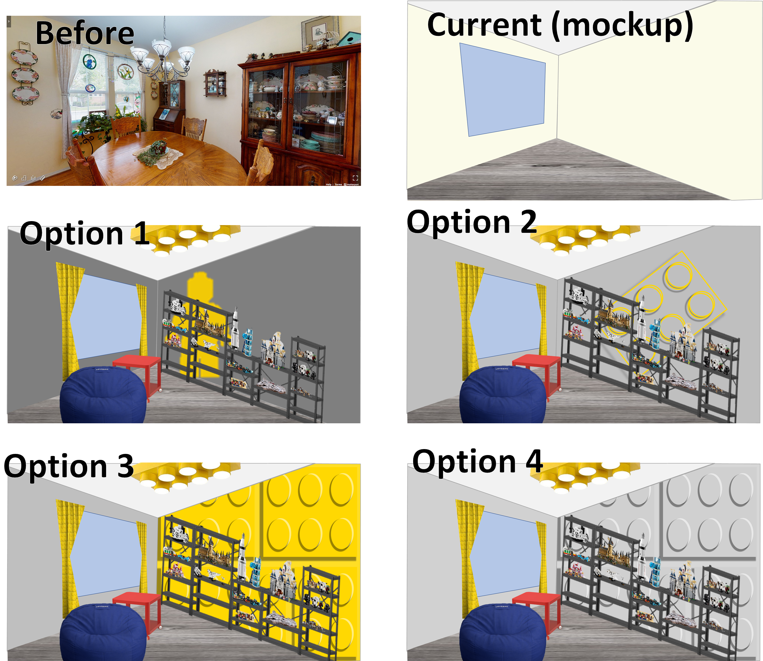
Pre-work: Choose your design. I had my friends on social media vote on my mural design, and the consensus was between options 3 & 4. Feel free to take inspiration from any of these designs! 


I plan to put a shelving unit for a Lego gallery in front of the wall, so I thought the yellow would be too distracting. Thus, I selected the gray design.

The key to this mural is that the base color is the same as the brick color and the top of the studs. So in all reality, after the base coat is up, all I'm going to paint are the highlights and the shadows. It's a negative space trick! Neat, huh?


How to Paint this Lego Mural

Step 1: Paint the base color. I actually brought to Home Depot a giant Lego block to do an exact color match (more precisely, I brought the gray Lego wall hanger). For the shadow I needed a darker gray, and I used a swatch that went well with my lighter gray color. I had white paint lying around, so planned to use that for the highlight color (later, I decided  that the white was too stark, so I mixed some of it with the wall color).

Step 2: Cut a pizza pan-shaped circle in an old Lego box. The mosaic kits are great square boxes for this purpose. I'll refer to mine as Marilynizza (you'll see why later).

Step 3: Measure Marilynizza, representing the size of the stud, and then determine relative dimensions, including room for shadows and highlights. These are rough dimensions I measured by using PowerPoint (because I'm a weird nerd and use PowerPoint for all visuals).


Step 4: Tape a grid on the wall. Notice it's not a perfect grid throughout. I've made room in between my "bricks", as indicated by the green tape. I started with the bottom to make sure I had my technique down, and also because I got tired of taping and wanted to dive into the painting!


Step 5: Line up the bottom and left edges of the taped square with Marilynizza.


Step 6: Trace the outside left and bottom. With paint. Specifically, a darker shade than the base coat, to create the illusion of a shadow. A smaller, artistic brush, is recommended for this.


Step 7: Slide Marilynizza over and fill in the gap with the shadow-colored paint. Just for fun, the color of the wet paint in the darker grey looks almost exactly like the dry color of the lighter grey, making an additional challenge in ensuring coverage. The good news, shadows can be a little fuzzy, so it's okay if it's a little imperfect.


Step 8: Remove Marilynizza and watch the paint dry. Just kidding! You have a million more studs to do, keep going! 

Pro Tip: I noticed the paint started getting on the back of Marilynizza and then transferring to the next part of the wall where I didn't want it, so I started wiping the paint off the back of her after each "stud" was complete.

Step 9: After the paint has sufficiently dried, use the other side of Marilynizza to paint the highlights of the studs. Line her up with the top and right edges of the box for the first trace in a lighter color or white, then slide her over and fill it in, just like before! 

Pro Tip: Once the tape is up, painting the crescent shapes for the stud shadows and highlights went pretty fast. For the upper ones, I needed an extra pair of hands so my love supported by holding the paint while I was up on the step ladder with my Marilynizza and paintbrush. For studs at height, definitely a good idea to have a partner to help you out! 


Step 10: Remove the tape for the stud sections, and put any more tape down as needed to line out the shadows of the Lego bricks. 

Step 11: Paint the shadows in the darker color. (This also goes quite quick. I was too excited so I forgot to take a picture of the tape before painting.)


Step 12: After the paint dries, remove your tape and do any touch-ups as you see necessary.


Step 12.5: Enjoy your new mural! Or, immediately cover it up with all your more intricate Lego builds! 

I am thrilled with how the mural turned out! Even with some imperfect measurements I noticed half way through the project, I think the objective of the vision was achieved. My technique was certainly inconsistent from stud to stud, repeated over 28 times on both sides, but none of those details really show when you look at the broader picture. 

Stay tuned (and subscribe) to see how the Lego Gallery room comes together. Lights, curtains, furniture, and of course, the Lego sets and MOCs, still to come! 

Next up: Lego curtains!

Saturday, October 9, 2021

DIY Lego Artwork: Silhouette Templates for Lego Mosaics

Lego has been marketing to adults for some time now, but some of their recent additions have been vying for space on our walls as artwork. If you love Lego but aren't artistic enough to make complex pieces of artwork, with shading and fancy techniques like that, you've come to the right place! This simple technique will allow you to design big, bold graphics while still being a custom art piece you can claim is all yours! The key to this technique is that you create a template to follow before you even pick up a brick. 

 
As you may know if you've read my other How To blog posts, I use PowerPoint to do much of my designing. It's super silly in some ways, but it is because I am comfortable with the tools and it is a nearly universal software that most people have. What I'll describe here is a pretty easy process that doesn't require much artistic ability, just a lot of patience and diligence. We'll first create a basic transparent grid of one color, use a silhouette graphic for reference, and then "trace" the reference graphic by filling some of the squares a different color. 


1. To start, open up a new, blank presentation. Draw a square by using the rectangle tool and holding down Shift to ensure the height and width are equal. Make it relatively small, since you'll be making a lot of these. Mine ended up being 0.26" by 0.26". 

2. Use the Format Shape options to choose the color you want as the background color for your design.

3. Increase the Transparency of the Fill to about 32%. This is really important, so you'll be able to see the reference image later.

4. Add a Solid line that will be visible as well, this well help you see the borders of each shape, both when you're duplicating them and creating the grid, and later when you're drawing your silhouette. I used 1.75 pt Width and a fairly dark color.

5. Now, we get to the tedious copy and paste steps. A word of warning, it is worth spending the time to make sure the lines are very straight and lined up here. Copy the square and paste it. PowerPoint will put the new square slightly offset. 

6. Grab that new square and drag it next to the first one. Automatic guidelines will temporarily appear and help you ensure that it matches the alignment of the first square. When you're satisfied, release the mouse. If you're not happy with the alignment, you can click on it and move it again, or use the arrow keys on your keyboard to adjust slightly.

7. When you're happy with that alignment, copy both squares and paste, to make a 2x2 square. You'll notice the guidelines will disappear if they're not well aligned and will re-appear when they are aligned.

8. Keep copying and pasting bigger and bigger rectangles or squares until you have the desired size (you can keep track of this by making a 2x2, then 4x4, then 8x8, etc). I chose a 32 x 32 grid because that's one of the sizes for the base plates, so that would be easy to mount because it doesn't require additional plates. For reference, the Lego art pieces are 48 x 48. If you plan to purchase one of those sets in order to re-purpose the frames and pieces, then you'll want to make your grid 48 x 48 to match. Another note: when you have the top half, if it looks like you're going to exceed the size of the slide, you may want to slide the whole grid up slightly above the slide so that the bottom portion doesn't try to snap to the edge of the slide. 


9. Now, if you don't have a reference graphic you want to emulate already, use Google Images and search for the topic you're interested in and use the word "silhouette" in search if needed. Ideally, look for a simple graphic with a white or transparent background and a black or very dark graphic.

10. Copy and paste the image into a new slide and enlarge it if needed. Use the 

11. Remove Background feature if needed to remove distracting things in the background. If the silhouette is the wrong color and you can find a good graphic to use that has the right color, you can also utilize the Color and Corrections tools in PowerPoint to make white outlines black, etc.


12. Copy the updated graphic to the slide with your grid. Adjust the size of the reference graphic to fit in the grid but also to take up as much space as possible in the grid.
 

13. If the "shape" containing the graphic isn't extending beyond the grid, it's a good idea to use the Crop tool to actually extend the shape. This will allow you to select the graphic to delete it later.
 

14. It's also a good idea to make a copy of this finished reference graphic to a blank slide just in case.
 

15. Now, go back to the slide with the grid and the reference silhouette graphic. Right-click on the reference graphic and select "Send to Back". Since you made the fill of the squares transparent, you should see the silhouette still coming through but less clear.


16. Select just one box in the grid which is showing inside the silhouette, and change the color to whatever you want to use as your foreground. In the example, I just used white as my foreground color, but because it still has the transparency setting, it looks grey because the reference graphic is black. This is fine for now, you'll see  it more clearly later.


17. As much fun as selecting each box and changing the fill each time would be, there is a REALLY helpful tool here that's going to make this a bit faster: the Format Painter. If you've never used the Format Painter before, now's the time to learn. First, click the newly colored square (the white square in my example), then Double-Click on Format Painter. Now, every square you click will turn that color (and take on all formatting) until you either click outside of the shapes or hit Esc on your keyboard. Be sure not to hit your reference graphic (use Undo if you do).
 

18. Using this tool, you can start "coloring" the area that your silhouette shows. Don't worry if you go too far, you can always use the Format Painter to go back over squares you want to change back. Keep "coloring" until your silhouette is mostly traced / covered. If you want to see how it looks or check your technique, you hit Esc on your keyboard and delete the reference silhouette graphic - your art is taking shape! Use Undo to put it back in place.
 

19. If you do other steps before putting it back, use the copy of the graphic you made on the other slide, copy and paste it back on your main working slide and then use the "Send to Back" function again.

20. When you're happy with your "colored" pattern, delete the reference silhouette graphic and then select all of the squares and change the line to "No Line". This will give you a better view of what it will look like. Use Undo or add the solid lines back to use for a template. 


Voila! You now have a template for making your own custom Lego art. Time to go to the Lego Store for Pick-a-Brick or order online to get the pieces you need.


What are you going to create? Post pictures in the comments!


My finished product shown here, I added a sun behind my palm tree and used regular white bricks instead of the circles for the palm tree and frame. I needed the purple and yellow dots from two Marilyn Monroe sets and two 32x32 white baseplates to make this.


Pro-tip: Employ kids or significant others to help you out by defining so-many rows or columns that are one solid color, to lighten your load. Using my palm tree example, I had 9 columns on one side and 4 columns on the other side that were going to be all the same color, as highlighted in darker blue here. You can use painter's tape to tape over the area you don't want them to place bricks on, if needed.


 Update: I made a second one in different colors!


Here's another example of a simple custom Lego Mosaic piece I created for a giraffe with sunglasses:

I used this AI-generated graphic as the inspiration:


Here's my design from PowerPoint:


Here's the final art:


For more complex graphics, this website is a great, free way to generate instructions: https://lego-art-remix.com/

Note that in Step 1 under Resolution, you can input the size of your canvas.